Tag: responsive-design

  • CSS Flexbox

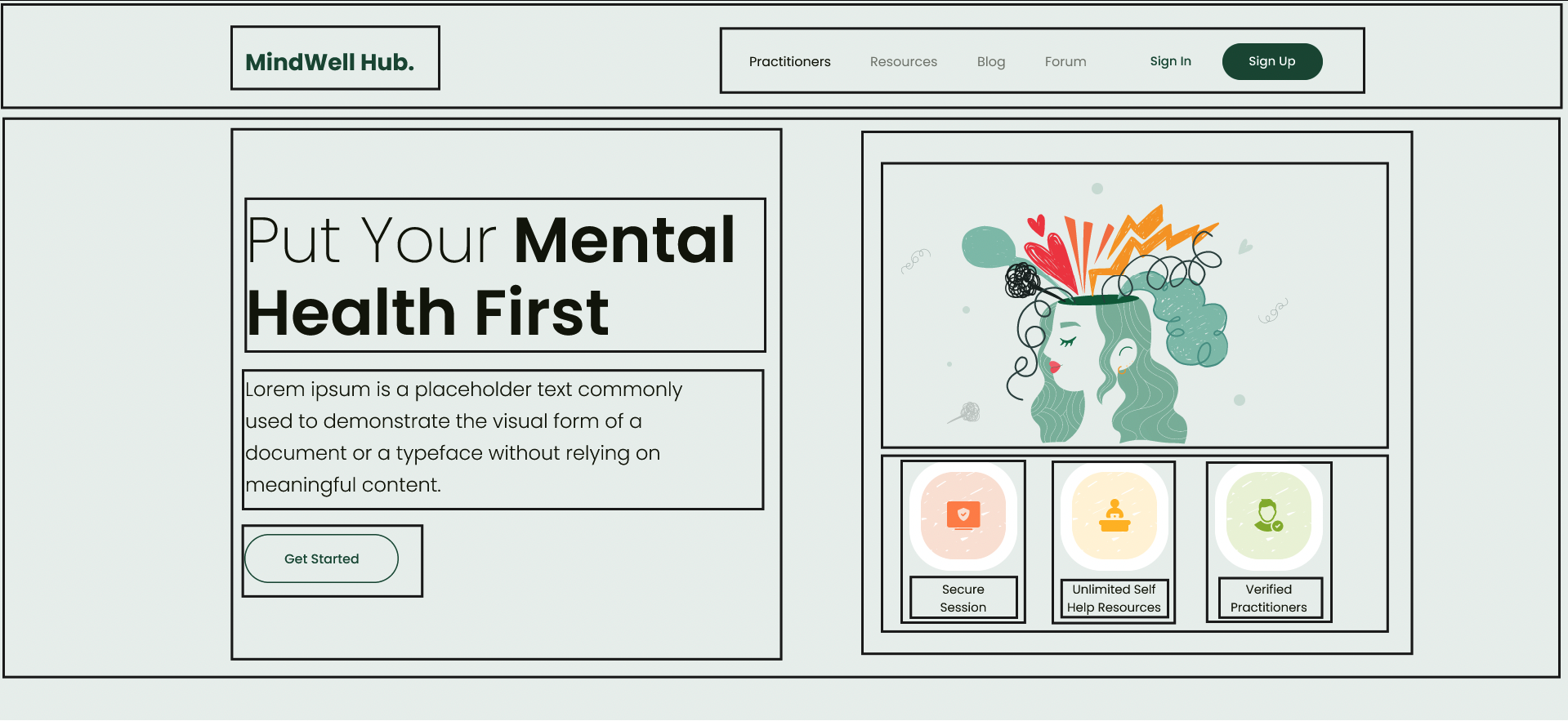
    There are lot of articles that define what flex box is, its different CSS properties etc, in this we will be creating a layout using flexbox given in below image and learn along the way

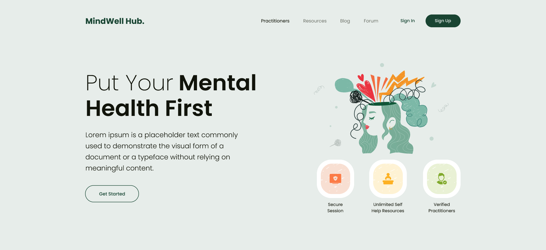
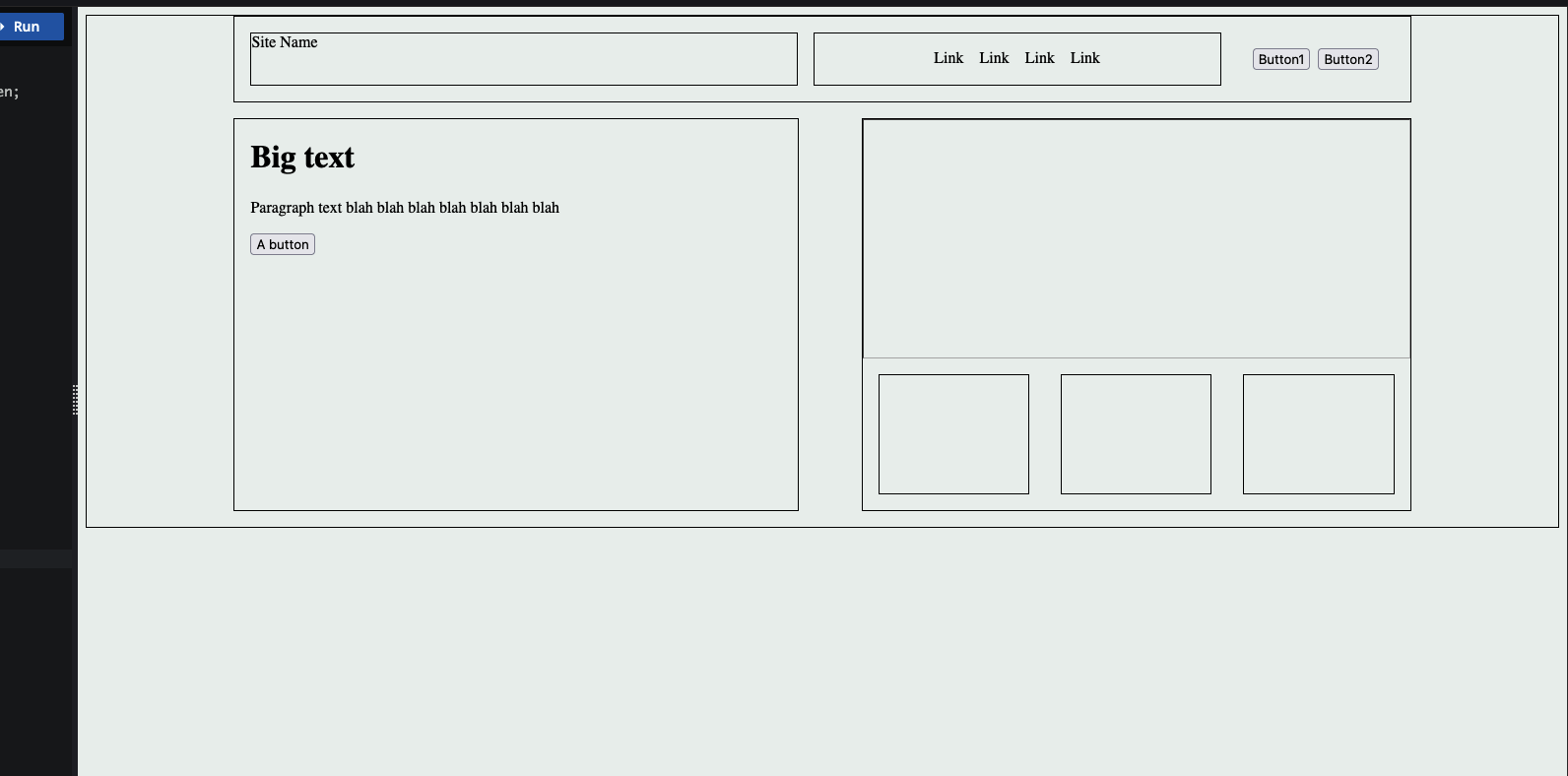
    Lets convert this into a simple layout outline only, no content itself

    Note: I am not very well versed with front-end stuff, so this just me learning and I might be totally wrong about this approach but will find out sooner,

    Ok so from design, it seems the section has main 2 parts one at top which we will call nav section and on below it we call hero section

    Nav section:

    Nav section also has 2 parts, one for the sitename/logo and other for the actual menu items ( it can be divided further but lets keep it simple for now )

    So we can use flexbox here to put this items in

    This is the layout I created ( it is nowhere near the actual one but we are close

    And here’s what I used,

    display: flex – obviously we have to set display of the container to flex to make it flex box

    justify-items

    So basically the flex box has 2 axis main axis and cross axis, main axis means the imaginary line that the items are added in, for example in row direction i.e default flex direction the main axis will be the horizontal line and the cross axis will be the vertical line. This will be reversed for the column direction

    To align items wrt to the main axis we use justify-content property and to align according wrt to cross axis we use align-items property, I mostly use justify-content in above since all the boxes are laid out in row direction

    Flex grow : this property is for flex item and not the flex container itself, this will decide if the flex item will grow and by how much, greater the number greater the space will be taken by this item, we can set it to 0 so flex item does not grow at all beyond its defined size

    Flex shrink: This is used to define if the flex item should decrease in size or not depending on the screen size, if set to 0, the item will not shrink

  • Sizes and units

    There are different units that can be used px, % , vw, vh, rem, em etc each with its own use cases.

    Pixels ( px )

    Pixels ( px ) is an absolute unit, it takes the number of pixels on the screen, eg. 20px

    Percent ( % )

    Percent is relative unit, it is percentage number of size of the parent, eg 20% will be 20% of the parent

    px vs %

    vw and vh

    View Width and View height as the name suggests are relative to the viewport height and viewport width, so 50vw will be 50% of the view width, 50vh will be 50% of view height

    REM and EM

    These units are used for font sizes, rem is root font size and em is for parent font size , so 1rem will be 1x of root font size and 1em will be 1x of parent font size

    eg, below the first rem em look same since their parent is the body so both rem and em values will be same, but in the second one I’ve put them in a div and added font size 30px for the div, so now the rem still takes the root font size but em takes the parent font size

    Note: We can also use % for font sizes, it works same as em since both em and % are relative to parent, i.e 200% will be 2em

    Ohk, I know the units, but which one to use where ?

    for fonts ? use rem, using em is also possible but rem is better since it will scale according to root font size

    For width ? set in percentage, maybe vw/vh

    Height ? do we really need to set height ?

    spacing ( padding, margin etc ) ? I am not really sure about this since I’ve been using px for this, but using em/rem to make it relative to font size seems like a good idea too

    Pixels ? what about pixels ? well pixels are absolute i.e they are not going to scale,change relative to anything, they are going to stay the same so avoid overusing them and stick to relative units as much as possible