There are different units that can be used px, % , vw, vh, rem, em etc each with its own use cases.
Pixels ( px )
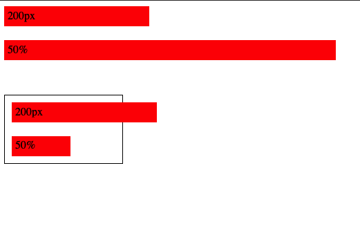
Pixels ( px ) is an absolute unit, it takes the number of pixels on the screen, eg. 20px
Percent ( % )
Percent is relative unit, it is percentage number of size of the parent, eg 20% will be 20% of the parent
px vs %
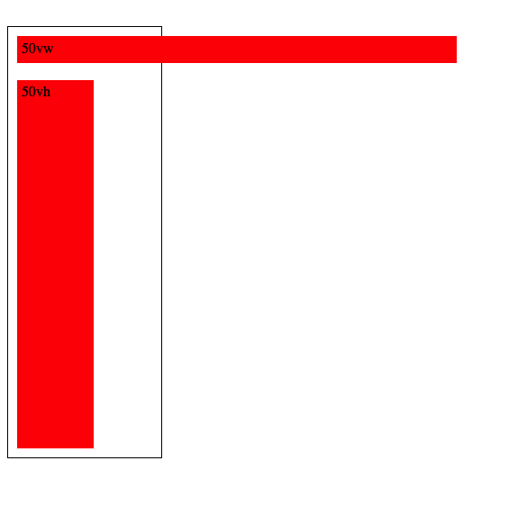
vw and vh
View Width and View height as the name suggests are relative to the viewport height and viewport width, so 50vw will be 50% of the view width, 50vh will be 50% of view height
REM and EM
These units are used for font sizes, rem is root font size and em is for parent font size , so 1rem will be 1x of root font size and 1em will be 1x of parent font size
eg, below the first rem em look same since their parent is the body so both rem and em values will be same, but in the second one I’ve put them in a div and added font size 30px for the div, so now the rem still takes the root font size but em takes the parent font size
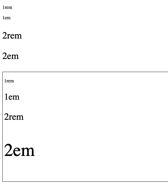
Note: We can also use % for font sizes, it works same as em since both em and % are relative to parent, i.e 200% will be 2em
Ohk, I know the units, but which one to use where ?
for fonts ? use rem, using em is also possible but rem is better since it will scale according to root font size
For width ? set in percentage, maybe vw/vh
Height ? do we really need to set height ?
spacing ( padding, margin etc ) ? I am not really sure about this since I’ve been using px for this, but using em/rem to make it relative to font size seems like a good idea too
Pixels ? what about pixels ? well pixels are absolute i.e they are not going to scale,change relative to anything, they are going to stay the same so avoid overusing them and stick to relative units as much as possible
Leave a Reply