This microcontroller is crazy small, but has only 8 pins ( still enough to do a lot of crazy shit)
I saw this board while watching Mr. Robot S04E10: 410 Gone, and I wanted to try it. Yes, it can be used as a rubber ducky for HID attack testing, but I have no idea how to do it, so let’s start small with trying to blink the onboard LED
We will be using Arduino IDE for this. First, put this in “additional boards manager URLS”
For this, go to file-> Preferences and paste the following
http://digistump.com/package_digistump_index.json
Click ok, and then open Tools ->Board->Boards Manager and search for “digistump AVR Boards” and install it.
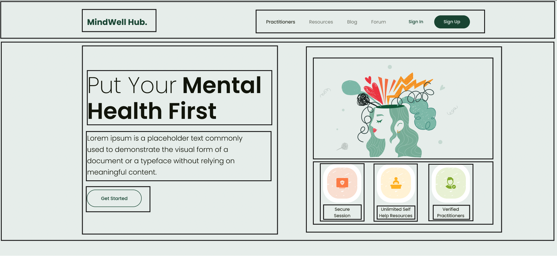
There are lot of articles that define what flex box is, its different CSS properties etc, in this we will be creating a layout using flexbox given in below image and learn along the way
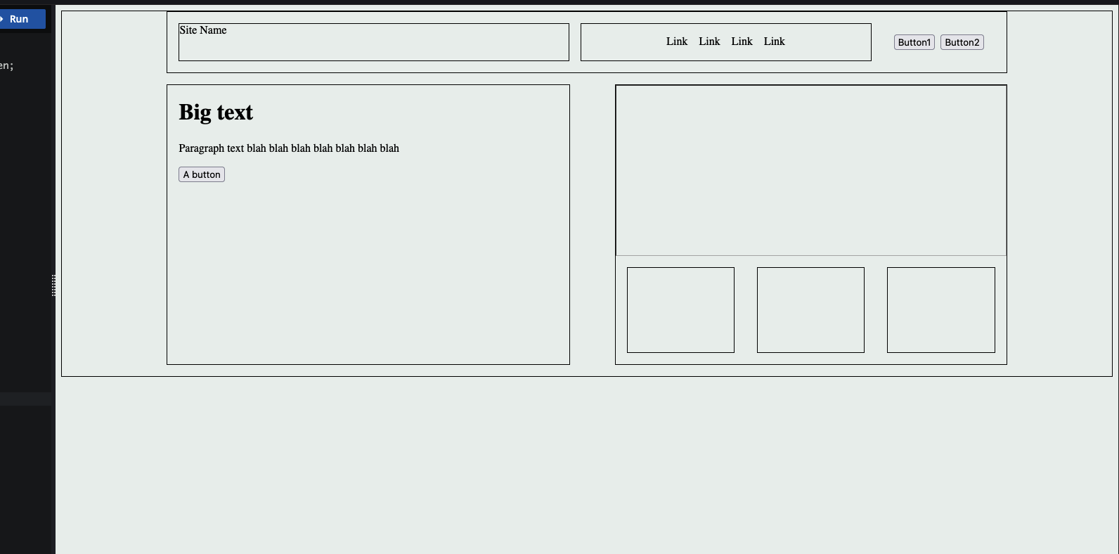
Lets convert this into a simple layout outline only, no content itself
Note: I am not very well versed with front-end stuff, so this just me learning and I might be totally wrong about this approach but will find out sooner,
Ok so from design, it seems the section has main 2 parts one at top which we will call nav section and on below it we call hero section
Nav section:
Nav section also has 2 parts, one for the sitename/logo and other for the actual menu items ( it can be divided further but lets keep it simple for now )
So we can use flexbox here to put this items in
This is the layout I created ( it is nowhere near the actual one but we are close
And here’s what I used,
display: flex – obviously we have to set display of the container to flex to make it flex box
justify-items
So basically the flex box has 2 axis main axis and cross axis, main axis means the imaginary line that the items are added in, for example in row direction i.e default flex direction the main axis will be the horizontal line and the cross axis will be the vertical line. This will be reversed for the column direction
To align items wrt to the main axis we use justify-content property and to align according wrt to cross axis we use align-items property, I mostly use justify-content in above since all the boxes are laid out in row direction
Flex grow : this property is for flex item and not the flex container itself, this will decide if the flex item will grow and by how much, greater the number greater the space will be taken by this item, we can set it to 0 so flex item does not grow at all beyond its defined size
Flex shrink: This is used to define if the flex item should decrease in size or not depending on the screen size, if set to 0, the item will not shrink
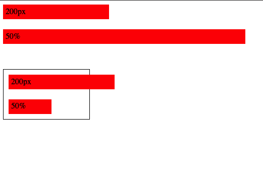
There are different units that can be used px, % , vw, vh, rem, em etc each with its own use cases.
Pixels ( px )
Pixels ( px ) is an absolute unit, it takes the number of pixels on the screen, eg. 20px
Percent ( % )
Percent is relative unit, it is percentage number of size of the parent, eg 20% will be 20% of the parent
px vs %
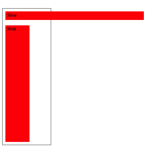
vw and vh
View Width and View height as the name suggests are relative to the viewport height and viewport width, so 50vw will be 50% of the view width, 50vh will be 50% of view height
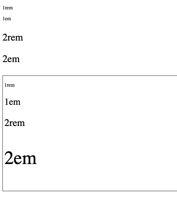
REM and EM
These units are used for font sizes, rem is root font size and em is for parent font size , so 1rem will be 1x of root font size and 1em will be 1x of parent font size
eg, below the first rem em look same since their parent is the body so both rem and em values will be same, but in the second one I’ve put them in a div and added font size 30px for the div, so now the rem still takes the root font size but em takes the parent font size
Note: We can also use % for font sizes, it works same as em since both em and % are relative to parent, i.e 200% will be 2em
Ohk, I know the units, but which one to use where ?
for fonts ? use rem, using em is also possible but rem is better since it will scale according to root font size
For width ? set in percentage, maybe vw/vh
Height ? do we really need to set height ?
spacing ( padding, margin etc ) ? I am not really sure about this since I’ve been using px for this, but using em/rem to make it relative to font size seems like a good idea too
Pixels ? what about pixels ? well pixels are absolute i.e they are not going to scale,change relative to anything, they are going to stay the same so avoid overusing them and stick to relative units as much as possible
CSS position property defines how the element is positioned wrt to the document flow
There are following types of positions available
Static
Relative
Absolute
Fixed
Sticky
Static is what all elements are positioned by default, statically positioned elements follow the normal document flow
Relative positioned elements also follow the document flow same as static but it enables properties like top,bottom,left,right which we rarely use
Absolute position elements are not considered part of the document flow and changing their placement does not affect the other elements in the page
Absolute also allows for properties top,bottom,right,left which define the spacing of the elements from parent with one imp thing that the parent of the absolutely positioned element should be relatively positioned, if not then it takes the upper parent that is relatively positioned or the whole page itself
Fixed positioned, as it describes makes the element fixed to the page, i.e the element does not go out of view even when scrolling. (eg. top nav bars of the site that stay visible even when scrolling or the annoying ad banner that stay in the place even when scrolling )
Only pain point here is that this takes the element out of the document flow, so say for eg we want to put something above our nav menu, making it Fixed will not work, that’s when the sticky position is used
Sticky position is combination of both relative and fixed, i.e sticky element will act like a relatively positioned one when in view but as we scroll down it will become fixed, when it becomes sticky can be handled by the top property, it also again becomes relative when its parent is not longer in view, awesome right?
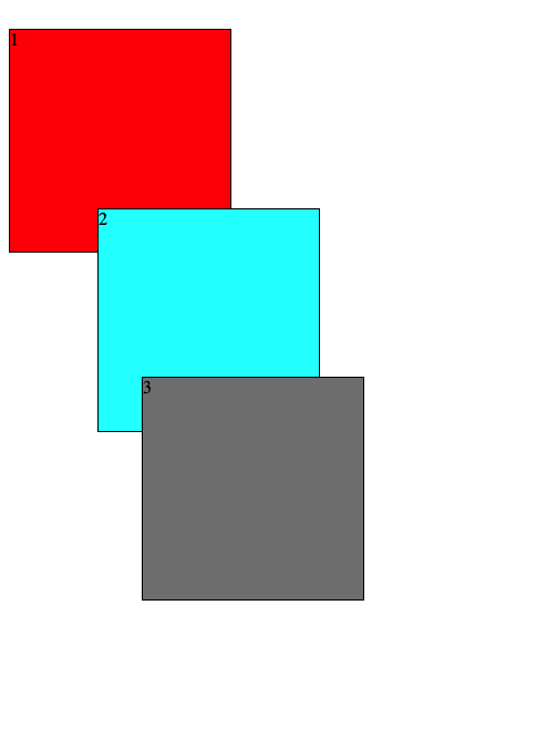
Z index and stacking order
When we position elements such that they stack on top of each other
Higher the value of z-index more on top the element will be, we can use this to stack the elements differently and create layouts and or components that look appealing
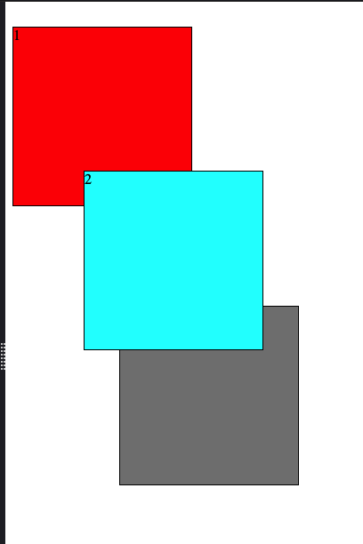
Stacking Context
stacking context determined how the elements layer on each other, eg, a div positioned as relative and z-index other than auto will create a stacking context for all the elements inside it so the elements will share the stacking context with their siblings but the parent div itself will be in its parents stacking context as single unit, i.e even if we increase z-index of the elements inside the div more than the parent of the div, they will still be layered below the sibling of parent if parent’s z index is lesser ( ahh so confusing )
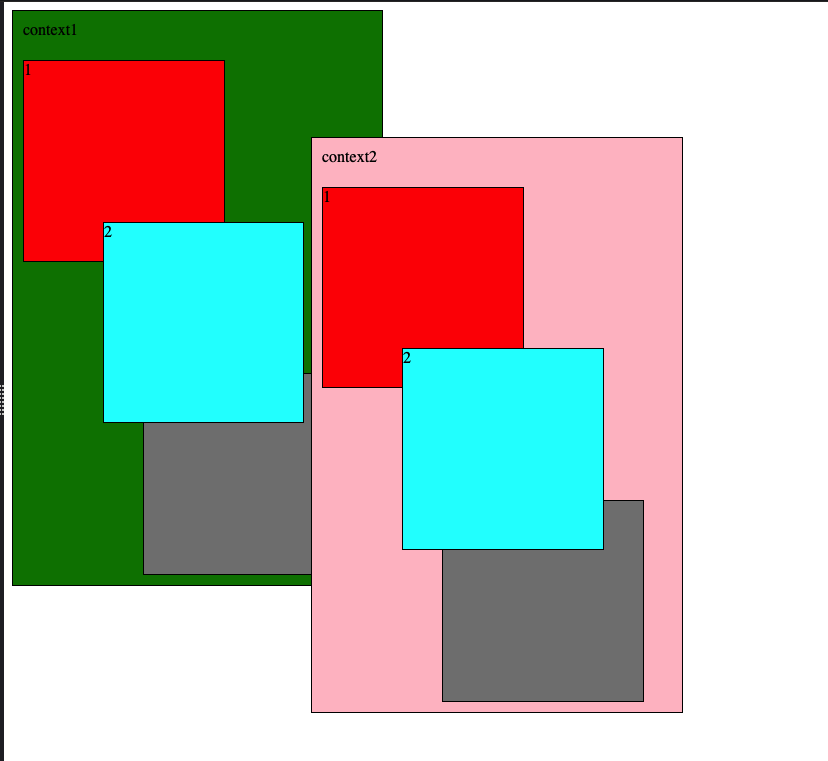
eg, say we have 2 sibling divs
Now both of these are relative positioned, but as you can see, even if we increase the z-index of the children of context1 , they do not layer above the context2 since the stacking context restricts their layering to their own context
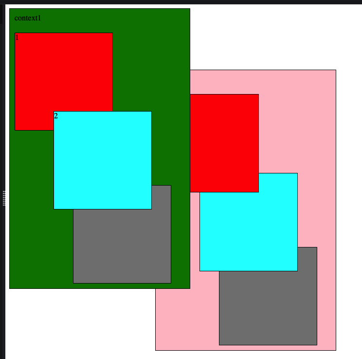
To bring the context1 up we have to increase z-index of the context1 to be greater than context2
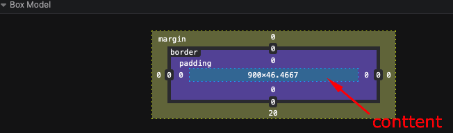
All elements in the CSS are represented as box , box has following properties
The content
Padding around the content
Border
Margin
The height and width CSS properties take up only the content height and width but the computed height and width of the element will be including the padding and border
This behavior can be disabled by using box-sizing: border-box CSS rule, which will make the CSS height width properties take the padding and border also in the consideration by default.
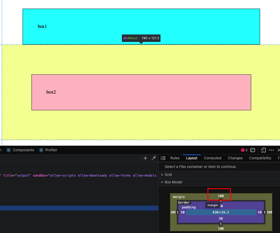
Margin Collapsing:
Margin property is used to add spacing between two or more elements, it is outside the border and does not increase height/width of the element
When two elenents adjacnet to each other have margin, then their margin is collapsed and only the margin with bugger value is applied
eg. below the box1 has margin 70px , and box2 has100px, we’d think the space between them would be 170px but it is only 100px due to margin collapsing
The elements inherit CSS properties from their parent elements that’s all it is.
eg, sa we have an HTML like below
<div>
    <p>Hello world!</p>
</div>
We can just apply a text color to the div tag and it will be applied to the p tag as well since it inherits from the div tag
div{
color: blue;
}
Note: Browsers also have some default styles set for elements, e,g buttons,anchor tags have some default styles from browsers in that case the inheriting will not work and we will have to add the specific styles to the respective tags
CSS is parsed from top to bottom, i.e style that is written at the top will be overridden by the one being written below it if they have same specificity
Specifity decides which styles to apply, more specific the selectors are more priority the styles get and the one with the most specigicity is only applied while overiding the lower ones
Element Selector
Class selector
Id selector
!important keyword
Inline styles
above selector are listed from least specific to most specific, they can be combined together to create rules that are more specific
e.g
#text-id {
color: pink;
}

.text{
color: black;
}
In above even though .text rule is after #text-id one, the #text-id one will be applied since it has more specificity
note : do not use !important since it is hard to override them
My code quality has improved a lot, one thing I learned since last 3 months of training at rtCamp is
If something works, we might believe that that is the way, only way to do it, but it is just only single way that worked at that time.
it may or may not work in future, even it may not be the right way to do things, we should always find multiple ways to do something and then choose one of them.
It is an Open Source E-commerce Plugin that we can use to create a full fledged online store and customize it to our liking.
It can also integrate with payment gateways, promotions emails, tax calculations and many things.
You have to give it a try, install on local to fully know its potential, it also has REST API support so we can use it as back-end and integrate with any other front-end of our choice
Testing
Why?
Why write tests, well its a silly question to ask. We test the code we write to make sure that it works or not, if our code doesn’t work of what use it will be. Is that the only aspect of testing? to make sure it works.
Writing Tests gives us confidence in our code, we can refactor the code as much as we want and if we do something wrong tests are there to know.
How?
We can test by multiple ways, one of the most sane idea is to run the code manually and check the output if it is what we expected or not, but what if the checklist is too long, we will not be able to do it manually.
We can use tools, that test our code, we have to write the test obviously but the tools automate all the other things, like running the test, generating report, check how much code is covered by tests etc.
Unit Testing
Unit of a software is like a smallest part that can be tested, for example a function that takes some input and gives some output, it is a unit.
We run the tests against this units individually, in isolation to catch any errors early.
PHPUnit
PHP Unit is a framework for testing PHP code, basically it allows us to write code that tests our code!
To install it we can get the PHAR (PHP Archive) and make it executable
final class EmailTest extends TestCase
{
    public function testCanBeCreatedFromValidEmail(): void
    {
        $string = 'user@example.com';

        $email = Email::fromString($string);

        $this->assertSame($string, $email->asString());
    }

    public function testCannotBeCreatedFromInvalidEmail(): void
    {
        $this->expectException(InvalidArgumentException::class);

        Email::fromString('invalid');
    }
}